Customize Your Mobile Design with the Squarespace Fluid Engine Editor
Squarespace has automatically created a responsive website (a website that resizes) for as long as I’ve been using it.
Until recently though, there weren’t many changes you could make to the mobile version without using code. You could change the layout of the mobile header, but that was about it. So, sometimes your image wasn’t where you wanted it or your spacing wasn’t quite right.
This all changed in Squarespace 7.1 with the Fluid Engine Editor. Squarespace still creates a responsive website for you, but now you can move and resize your blocks, creating your own mobile design. Plus, you can even change the spacing of your sections.
Do I Have to Edit the Mobile Version of my Squarespace Website?
The short answer is no or not anymore.
The Classic Editor had always based the mobile design on the location of each block in the desktop layout.
However, when the Fluid Engine Editor first came out it added blocks into the mobile version in the order that they were added to the desktop layout. So, if you added in some text and an image but then decided the section needed a title, the title would end up at the bottom of your mobile view. This created some strange layouts and almost every section needed editing.
A lot of people (including me) were not too excited by the idea that they had to edit every section twice.
Luckily, Squarespace listened to criticism and changed the mobile layout to the previous method, using the placement of items on the desktop layout. So most of the time your layout will be in the correct order and you won’t have to edit the mobile view.
The longer answer is that it’s a good idea to check the mobile version of your new section after you’ve completed it to make sure the layout is right for you. After you add a new block to any section you’ll see a blue dot over the mobile icon letting you know that the mobile version has changed too.
Fluid Engine also gives you the opportunity to make much more interesting layouts, designed just for mobile.
What Can I Customize in the Mobile Design with the Fluid Engine Editor?
To start customizing your mobile design click Edit, then click on the mobile icon in the top right corner. Or, if you’re already editing the desktop view, simply click on the mobile icon.

Then you are ready to start customizing the following:
Fluid Engine Blocks:
You can change the mobile layout on any block in a Fluid Engine section. This includes common blocks like text blocks, images, shape blocks and buttons. You can even layer blocks on top of one another.
Move your block into place by dragging it where you want to go. Or, to move a block above or below another, you can also click the block, then click the up arrow ↑ or down arrow ↓ in the popup box.
These layout changes work independently from your desktop version. So, changes you make in mobile won’t alter the desktop view.
You can also change the vertical alignment of some blocks, but the horizontal alignment and text alignment will stay the same in the mobile & desktop views.
Related Post: All the Squarespace 7.1 Sections (and how to use them)
Update: Show & Hide Blocks
Sometimes you need certain blocks for your desktop layout, but it just doesn’t look right in the mobile version. Usually that’s things like an extra image or shape block. Until recently, if you wanted to remove these blocks on mobile, you could layer them under another block or hide them using code.
Squarespace has now given us a much easier solution with the Layers Panel.
The Layers Panel shows you all the blocks in your section. You can drag each block to change their order (if you want to layer a block on top of another). And, you can also hide blocks. You simply hover over the block in your list and click the eye icon to show or hide.
Fluid Engine Rows:
Moving blocks around the mobile design means that sometimes you’ll need less rows than the desktop design and sometimes even more rows. Also, there are times where you end up with unexpected gaps that you need to close.
To change the number of rows in your section:
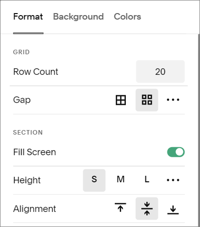
Click EDIT
Click on the mobile icon
Hover over your section and click EDIT SECTION from the pop-up
Change the number of rows
SAVE
*Only the number of rows can be changed independently of the desktop design. Any other edits to the section (gap, height, fill) will also be changed in the desktop view.
Mobile Layout Editing Tips
Leave a border around your text block:
Images and shape blocks can look great pushed right to the edges of your mobile design, but adding a little space around your text block will make it much easier to read.
Make sure you don’t have unintentional overlaps:
I love that I can now overlap blocks with the Fluid Engine Editor. It helps to add dimension and create some really interesting designs that we just couldn’t do before.
That said, it also means that you have to pay attention to how and where your blocks are overlapping.
For example, say you have a text block that overlaps a button. While it’s fine in one device, in a smaller device that same text could overlap the button, making it hard or impossible to click.
If those same blocks were separated the button block would just move down.
You can simply drag the bottom bar your text block (in this case) up to make it smaller.
*This is important in your desktop design too!
Test on real devices:
The Squarespace mobile view is great, but you are only seeing one size of screen. Some phone screens will be smaller or bigger and there are also tablets to consider. So try out your site on any mobile devices that you have and then head back to Squarespace if you need to adjust your design.
What if you don’t have any mobile devices or if you want to try it out on other sizes? Most browsers (Chrome, Safari, Firefox and Edge) have something called Responsive Design Mode or Device Toggle in their developer tools that allow you to simulate multiple screen sizes.
One Last Mobile Design Tip
Don’t forget to use the Squarespace image focus feature!
You can choose the focal point on every image you use, including your section background images. This helps to make sure that the best part of your image is showing no matter the size of your screen.