How to Style Your Header Navigation in Squarespace 7.1

One of the first things to do when you start your new Squarespace website is to create your header navigation. You need to make sure your visitors see your logo or site title and can easily find their way around your website. And, you want to make sure your navigation style fits with your branding.
Table of Contents
Add Elements to the Squarespace Navigation Header
Depending on the template you choose, you may already have all the elements you need in your navigation. But maybe you still want a button or a shopping cart icon. With the Squarespace header, you have the option to add a button, social links, a cart icon, a login for your customer accounts, or a language switching button.
To Add or Hide a Navigation Element
Click EDIT on the top left corner of your web page
Hover over the navigation and click EDIT SITE HEADER
Two buttons will appear below navigation, click + ADD ELEMENTS
Toggle the elements you want to add to the on position (green) or hide (grey)

Style the Desktop or Laptop Navigation in Squarespace 7.1
Now you’ll want to edit the design of you header navigation, starting with the layout, spacing and colour of the header. You can also style each element of your navigation.
Choose Your Layout & Main Design for Desktop
While in the desktop view:
Click EDIT on the top left corner of your web page
Hover over the navigation and click EDIT SITE HEADER
Two buttons will appear below navigation, click EDIT DESIGN
You will now see a pop-up menu with design options.

In the Design tab, you can choose a layout design (where each element is placed) from the dropdown menu, choose the spacing between your elements, add effects like a drop shadow, fixed menu or border, and choose the height of your header.
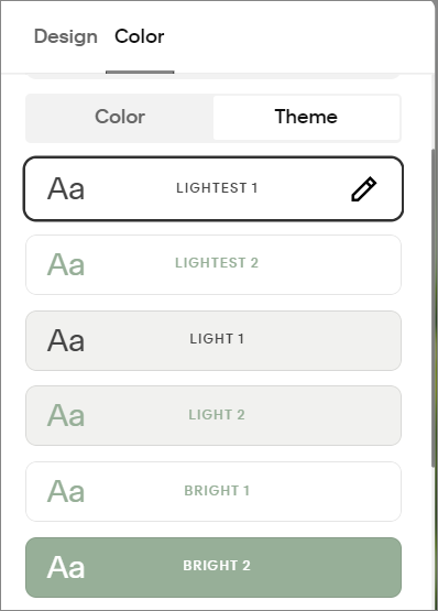
In the Color tab you can choose from 3 options for you background and navigation colours.
Solid: This option gives you the choice to pick your background colour using Theme or Color. Click on the Theme tab to choose one of your colour themes from Site Styles. Click on the Color tab to pick your own background and navigation colour. This option also allows you to set the opacity of your colour and add a blur effect.
Gradient: Choose this option to create a gradient with your chosen background colour. You can also choose the navigation colour, opacity and blur.
Adaptive: Want the background of your header to be transparent on images? Then the Adaptive option is for you. Its colour adapts to the colour theme choice of your first section.
*Any changes you make in the Color tab will also be applied to the mobile header. You will be able to make separate changes to the mobile menu in the mobile view.
Change the Fonts in Your Header Navigation
To edit the fonts in your header:

Click on the paintbrush icon in the top right corner to access Site Styles
Click Fonts
Click Assign Styles
You can change the font styles for your site title (if you don’t use a logo), the site navigation and the header button.
Style your Squarespace Header Navigation Elements
Each of the elements in your header navigation can be individually styled. I find this easiest to do in desktop view, but you can change the elements in mobile view as well.
To style an element:
Click EDIT on the top left corner of your web page
Hover over the navigation and click EDIT SITE HEADER
Click onto an element then click the pencil icon to access the style options
Logo or Site Title
In the Site Title/Logo style options you can add your main logo and an optional logo for mobile, and set their height. You can also change the Site Title.
Page Navigation
You can change the order of your pages by accessing the page navigation styles – but that’s it. If you want to change the font or spacing you’ll have to use the main header editor and Site Styles.
Button
Add your button text and link here and choose your button style. You also have the option to delete your button.
Social Links
You can add and remove links to your socials here. You can also choose the link style and size.
Cart Icon
There are many design options here including several icon choices. You can also delete your cart.
Style the Mobile Navigation in Squarespace 7.1
Your mobile navigation has two parts, the navigation header and the menu, where all the pages are displayed. You can style both these sections as well as the menu icon.
Style the Mobile Navigation Header
While in the mobile view:
Click EDIT on the top left corner of your web page
Hover over the header and click EDIT SITE HEADER
Choose EDIT DESIGN from the pop-up
This will bring up a new menu where you can choose the mobile header layout, as well as effects like a drop shadow and borders.
You can also make changes to the header colour using the Color tab. These changes will also affect the desktop navigation colour.
Style the Mobile Navigation Menu
Styling the navigation menu takes a couple more steps.
While in the mobile view:
Click EDIT on the top left corner of your web page
Hover over the navigation and click EDIT SITE HEADER
Choose VIEW MENU from the pop-up then click EDIT DESIGN
In the Design tab you can choose the alignment of your menu as well as the spacing. The Color tab allows you to choose one of your themes for the mobile menu.
Style the Open/Close Icon
Want a hamburger menu? How about a plus sign? You can choose from 4 icons to open and close your mobile navigation menu (I have no idea what the other two are called).
Click EDIT on the top left corner of your web page
Hover over the navigation and click EDIT SITE HEADER
Then click on the icon to change or edit
The styling menu will also allow you to choose the thickness of your icon.
I’m still hoping Squarespace introduces few more customizations for the navigation header. I’d love to have the split header or second header options that were available in Squarespace 7.0. You can of course, still create them (and more) with a plugin or some CSS. But for now, there are some great styling options in Squarespace 7.1.